UI/UX Design Trends to Look Out for in 2018
Trends are constantly forming and changing over time, following the organic evolution of technical possibilities and a general change of heart. Spring 2018 has come and a list of new trends have blossomed in the past year. While this is definitely not an exhaustive list to thoroughly check all boxes from, it is a good place to start to know what’s in and what’s out!
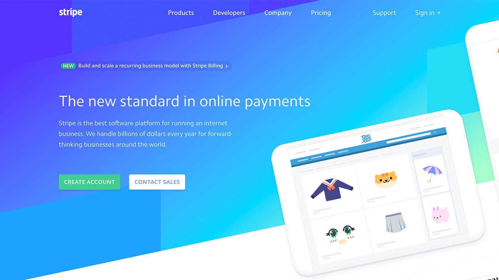
Source: Stripe
It’s evolving! Flat Design 2.0
Trends come and go in cycles. While we witnessed the transition from skeuomorphism to flat design starting a few years ago, it now seems that going 100% flat is already out. What designers now call “Flat Design 2.0” already began last year but keeps gaining ground. Exit solid colors, say hello again to gradients and drop shadows! Flat-style illustrations are also added on to the mix for vibrant websites and apps with added depth. It is also prepping the ground for micro-animations.
Life in Technicolor
Time to stop playing it safe! Designs are getting more colorful and bold when it comes to palette picking. Instead of sticking to only one branded color palette, brands are now adding a variety of color schemes to their identities. The use of duotones is also getting more and more popular whether on web design elements or photography, combining gradients and vibrant colors as a key ingredient to the new iteration of the flat design.
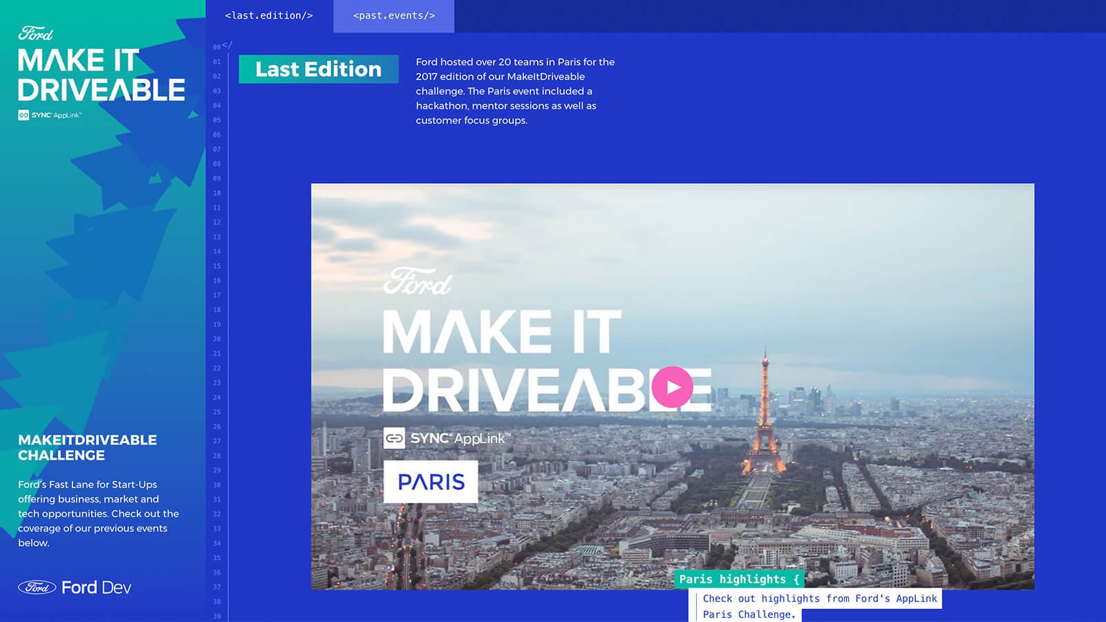
Source: Ford Make it Driveable
Sketch it up
Illustrations are definitely nothing new in UI design, but the resurgence of flat design has pushed brands to make a statement and market themselves as fun, fresh and friendly. Isometric-style illustrations are especially becoming more and more trendy, finding a good balance between game-like playfulness and strict geometric shapes.
From micro-animations to video design
Animations are a massive hit this year! Designers are mastering the art of CSS animations to add more spunk to their work, or are even going as far as tackling video design. Backgrounds and design elements are becoming increasingly interactive as well. They evolve according to the visitor’s use of the website, whether with the help of mouse-triggered events, smooth page transitions or micro-animations. It carefully contributes to storytelling with an added bonus of improved immersion and user experience.
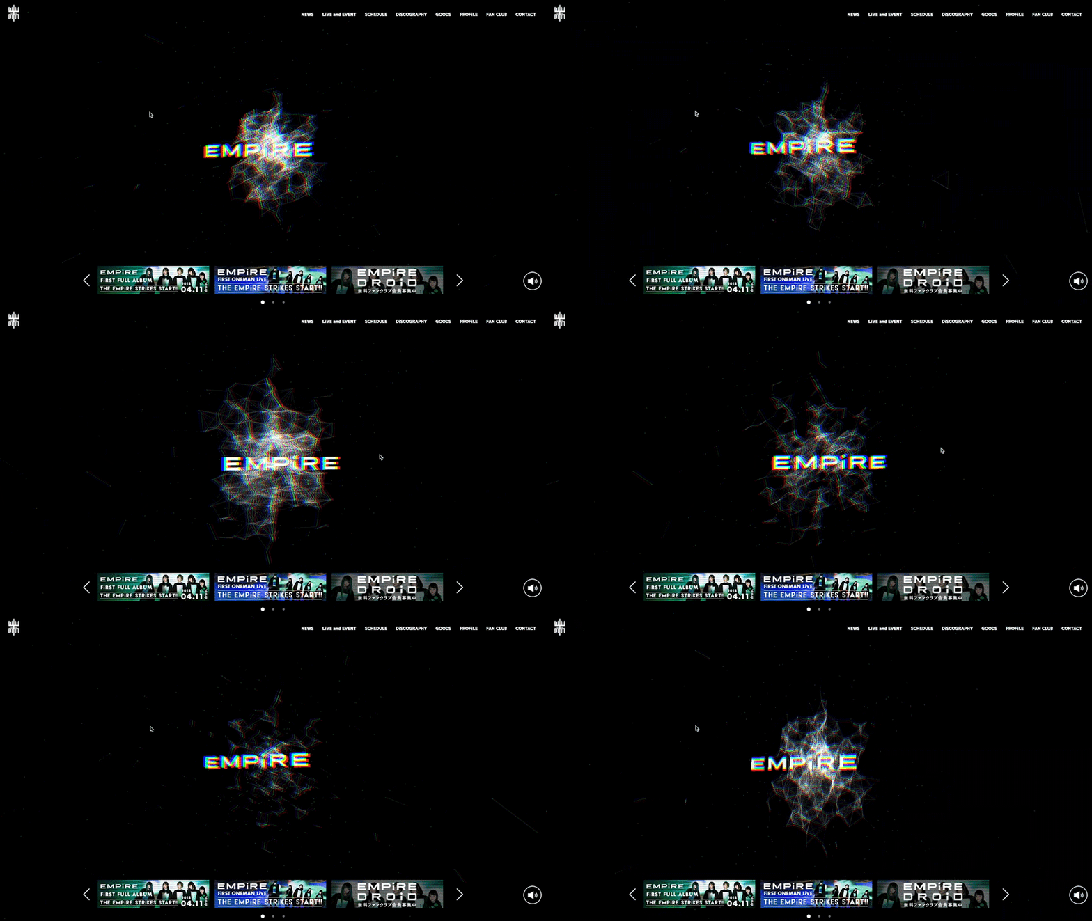
Source: EMPiRE official
Time to get off the grid
Let’s think out of the box! Website layouts are branching away from classic formatting. Designers are taking more risks by playing with blank spaces and experimenting with positioning. The creative use of geometric shapes, as well as the use of slants and diagonals, are steadily gaining ground to shake the boat of your average twelve-columns website.
Go bold or go home
Less is more: typography design becomes an illustration of its own! Big and bold fonts are in to convey messages powerfully, made possible by the growing use of web font libraries, CSS3 and SVG and applying the current fad of brutalism and minimalism. There is also a clear sub-trend for bold, graffiti-like handwritten text as well, making designs more human, disruptive and rebellious.
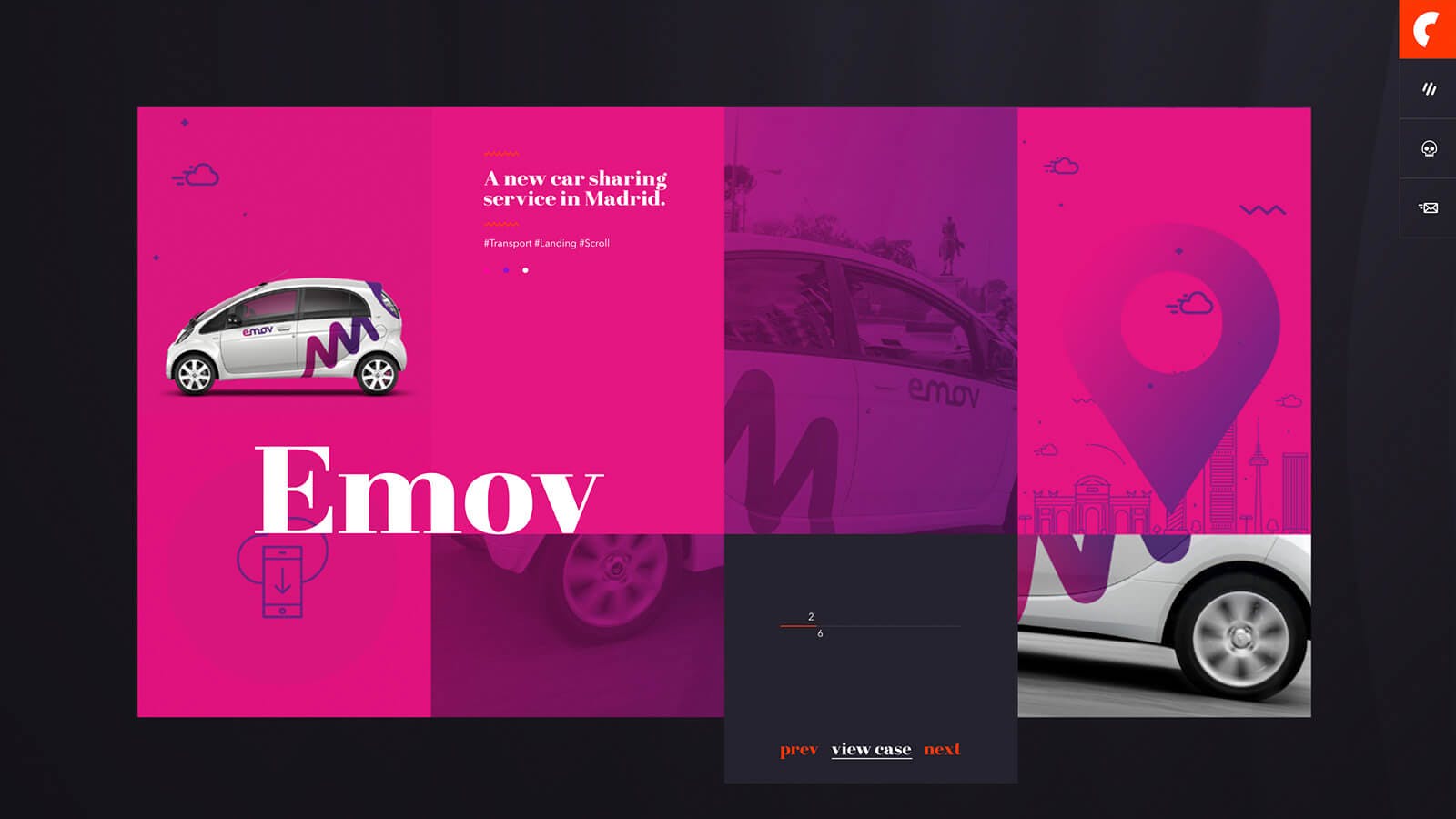
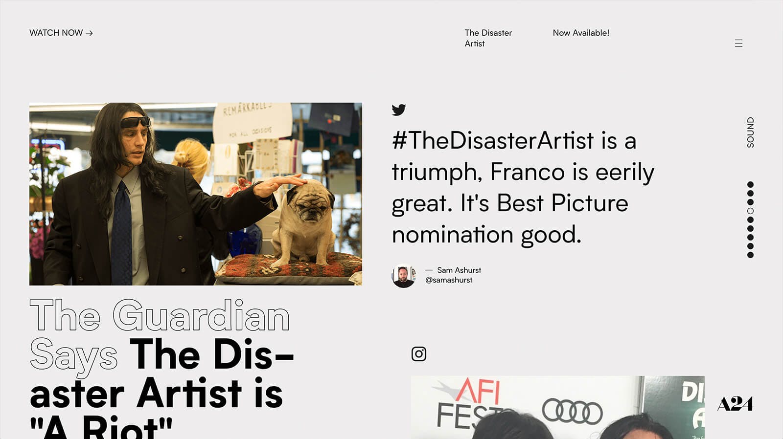
Sources: 22° (Veintidós Grados) (top) The Disaster Artist (bottom)
A step further: Mobile-first web design
The trend was already settling in with the rise of smartphone browsing, but it is now official: people access websites on mobile devices more than computers. Websites are now designed for smaller resolution screens, portrait formats and touch devices first before upsizing their responsive layout.
True Accessibility
We have heard of accessibility as a keyword for decades since it is one of the core best practices of web design, but the rise of new technologies and mobile devices raise new challenges for designers. It is not about incorporating additional features to make websites accessible to all users anymore. It’s about rethinking the User Experience completely by disrupting the source code itself. We won’t dive into details here, but accessibility is a wide subject. It features a long list of best practices for any good designer to follow to make their work more inclusive.
The list is far from being exhaustive and following these trends does not equal being innovative. It is now up to designers to appropriate what’s hot right now and try to turn it into their own unique work! The possibilities are endless and the trends are always changing. 2018 still probably has a lot of surprises in store for us to discover.